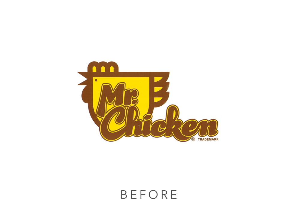
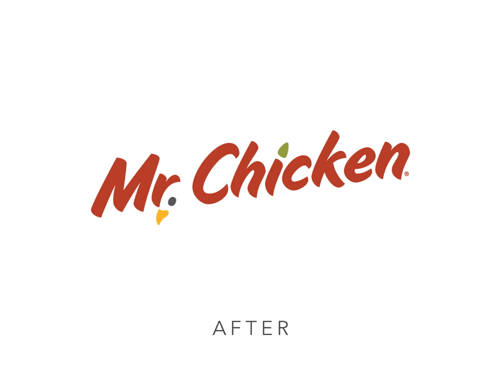
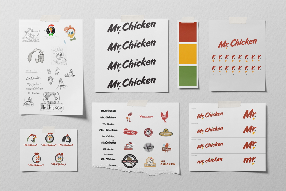
During our discovery process with Owner Michael Simens, he explained that Mr. Chicken was overdue for a major rebrand. He wanted to give Mr. Chicken a fresh look to match the quality of their product.
A major concern for Michael was staying authentic to what his loyal customers love about the restaurants. Ultimately, Michael wanted to maintain Mr. Chicken’s current customer base and bring in new customers.

Our goal for Mr. Chicken was to put its branding on equal footing with national chains. Doing that requires thorough market research, testing, and round after round of concept creation.
When we landed on a style the Mr. Chicken team liked, we revised and fine-tuned some more. We wanted perfection.

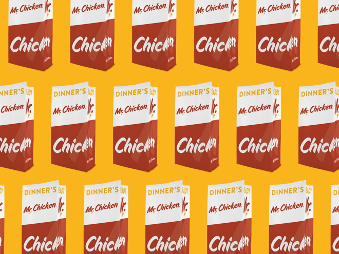
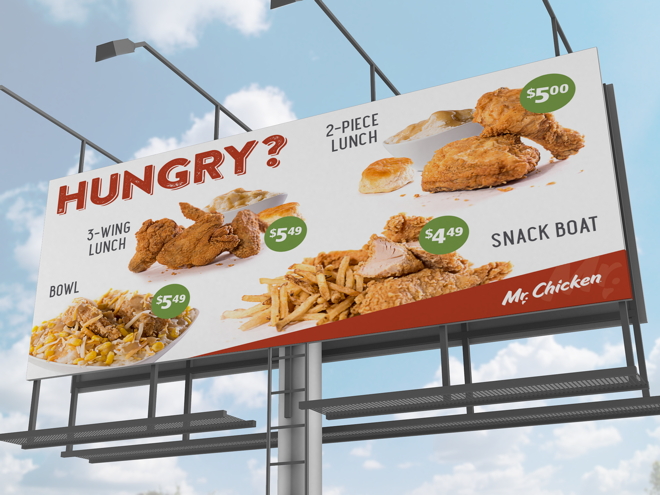
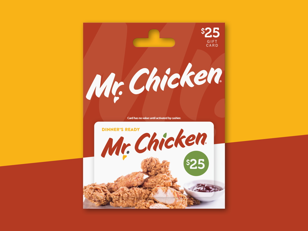
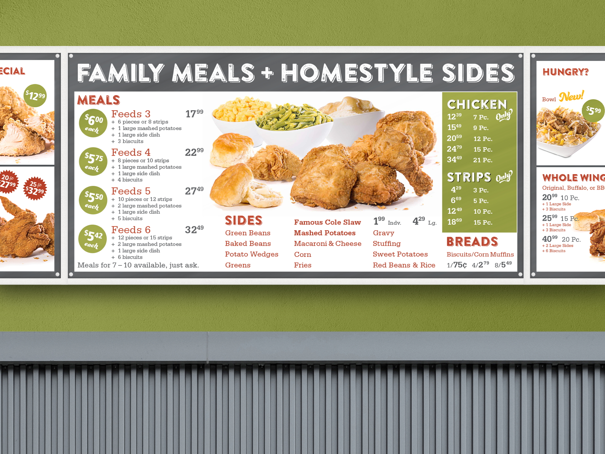
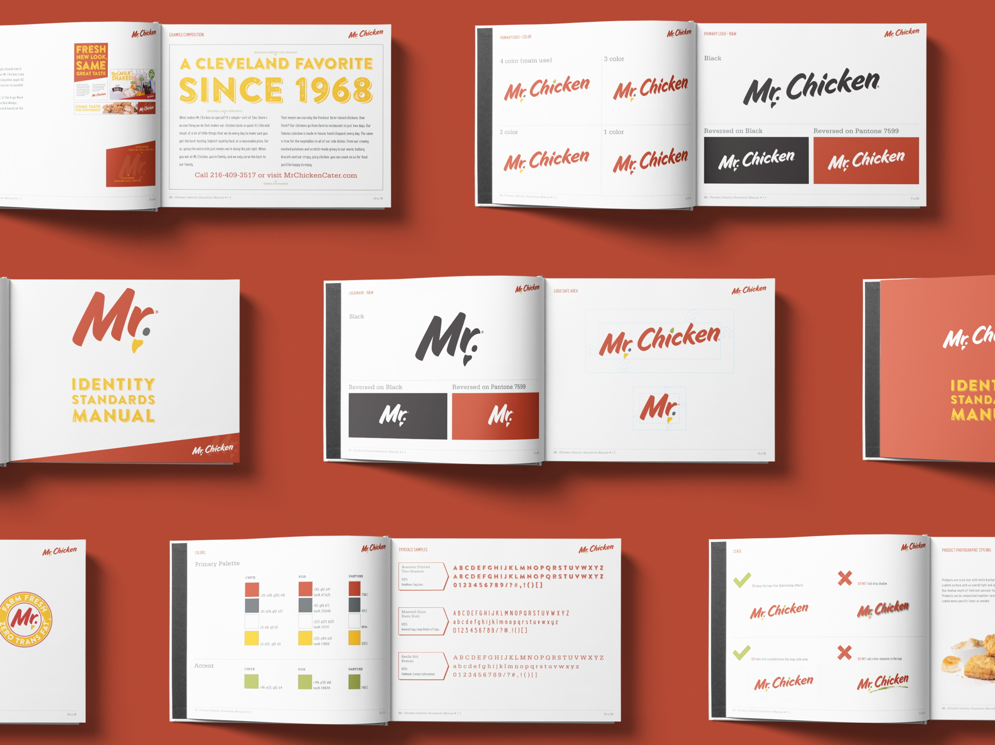
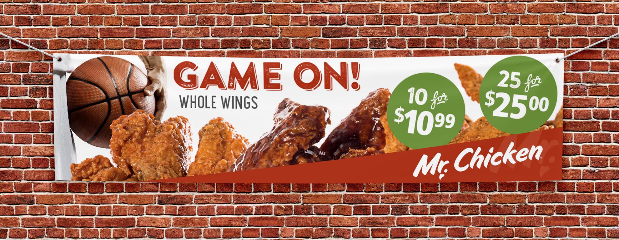
In total, we designed Mr. Chicken’s brand identity, tagline, packaging, signage, in-store and drive-through menus, marketing pieces, uniforms, gift cards, website graphics, and social media graphics.
Later in the process, we helped establish interior design and exterior architecture for improved curb appeal and customer experience.
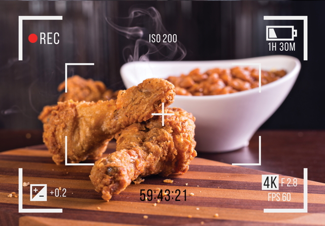
A third-party branding audit revealed that Mr. Chicken’s rebrand put them on par with larger, national brands. Our deliverables provided Mr. Chicken’s in-house marketing team with a storehouse of strong visual branding that they could run with for future campaigns.
Michael Simens chose KURTZ to undertake his restaurant’s rebranding on its 50th anniversary. After implementing the new campaign, Michael reported, “Our core guest base loved the changes, and we grew our business with new guests. Everyone who sees our new logo and box artwork comments on how attractive the updated look is, while retaining our identity. Thank you, KURTZ!”
