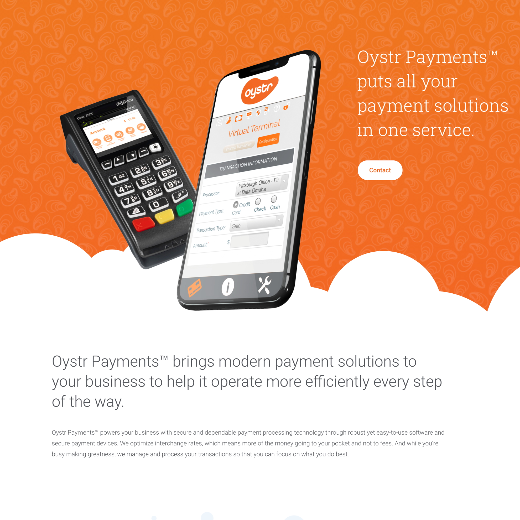
Oystr Payments Digs New Silicon Valley Look

Credit card payment processor in need of brand identity

Park Point Payments LLC is a white-label credit card payment processor based in Tampa, with its sights set on the health-care, insurance, and large manufacturing industries.

Their ideal clients want a reliable payment processor that gives users a seamless purchasing experience and saves them money.

Making a new brand look fresh but not green

Park Point brought us their ideas. Over calls and conversations, we discovered their vision—to offer a user-friendly interface with a Silicon Valley–esque image that would give their clients a sense of security because they’re working with a trusted brand.

A Full Identity For A Gem Of A Brand

Their goal was to launch a fully functional company with every piece in place. They needed to look established and familiar—like they have always been there. It was also important to Park Point that we support them throughout the process for a smooth launch.

Fortunately, we provide not only exceptional graphic design, but also an unparalleled customer experience. We prize collaboration and partnership with our clients from start to finish.

Casting a wide net for the perfect name

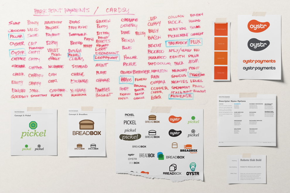
To accomplish Park Point’s goals, they needed a name that would support a strong brand identity. As a team, we brainstormed and filled a whiteboard with 100 potential names.

Then we cut that list to nine. Then three. Each name had strong rationale behind it. But we wanted the very best.

Together with Park Point, we decided on Oystr. Reminiscent of “clams”—slang for dollars—Oystr is short, clever, and highly Googleable.

The money reference resonates with the brand’s function as a payment processor, but not in an overly obvious way. And since oysters produce and protect valuable pearls, the metaphor is sound.

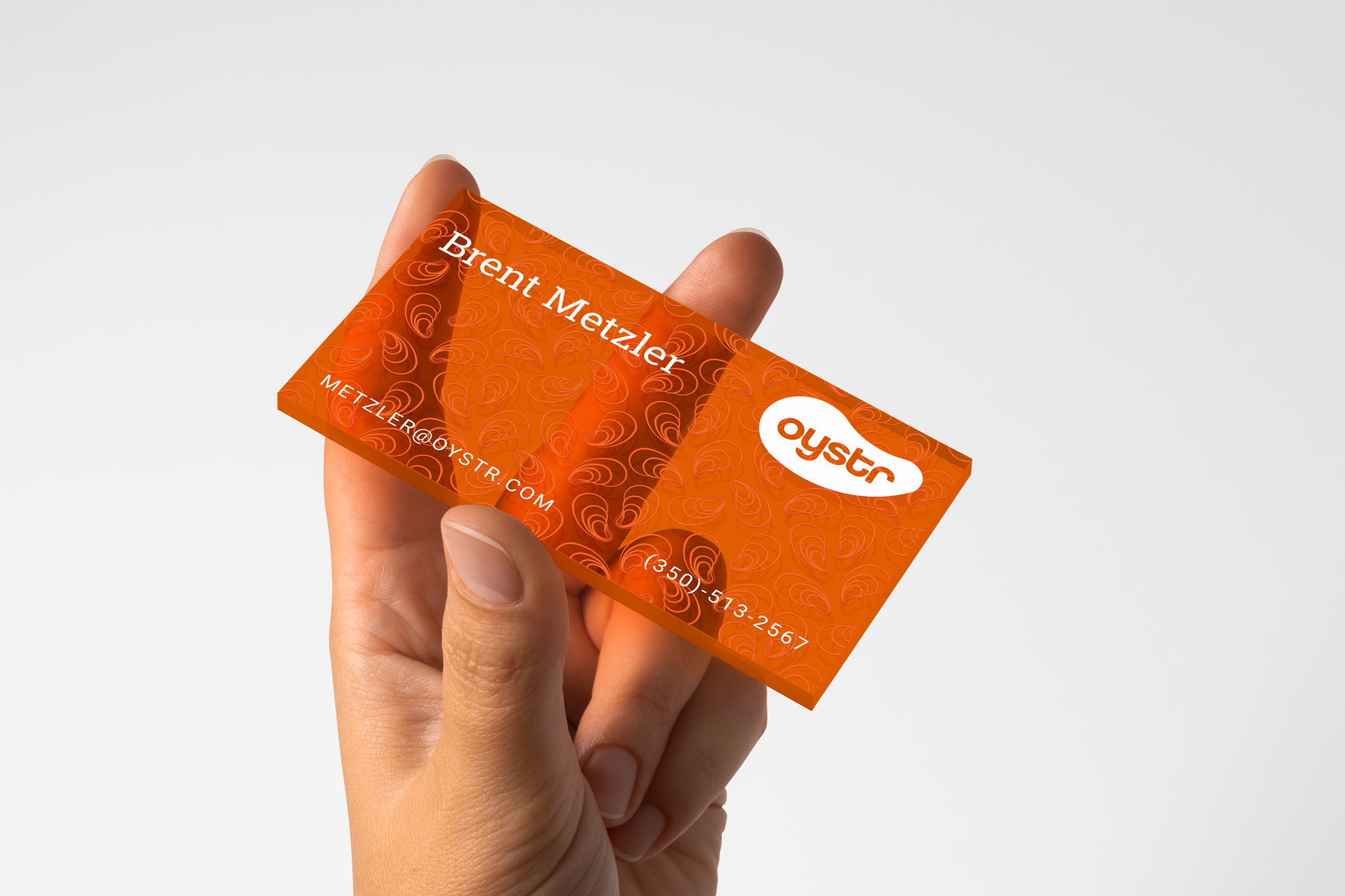
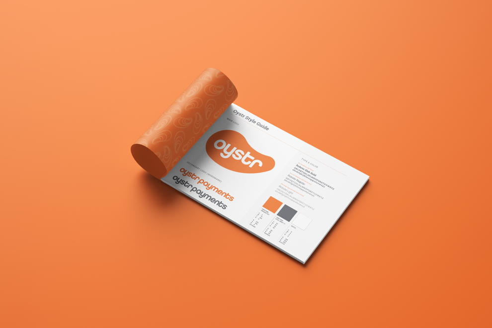
With a name in place, we turned our attention to brand identity, starting with the logo. We decided on a design that features “Oystr” in white type against a vibrant orange oyster-shell-shaped background.

The “O” of Oystr represents the much sought-after pearl and nods to Oystr’s data defense system, which we named Perl. The modern logo clicks with competitors’ logos, but the striking orange sets it apart.

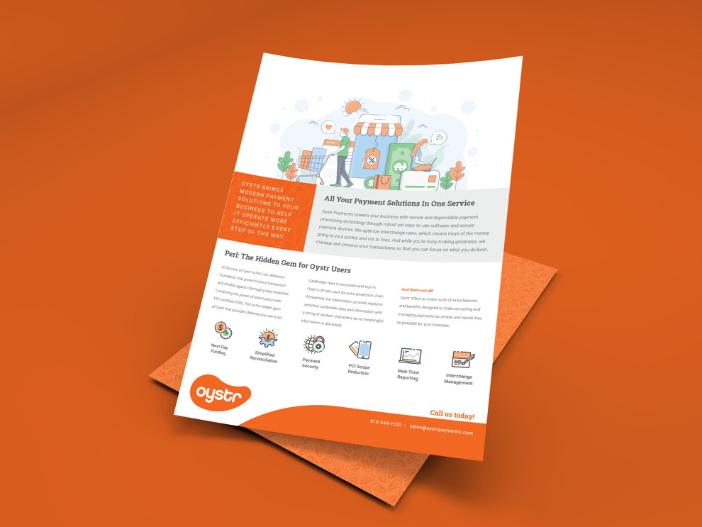
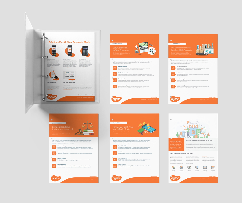
Next we designed, developed, and refined mock-ups for Oystr’s website, business identity system, and sell sheets.

With Park Point’s invaluable feedback, we produced a comprehensive brand identity, consistent at every client touch point.

KURTZ made what I thought would be a huge undertaking feel easy. I couldn’t ask for a better experience.

Owner
Oystr Payments

In a short period of time, we constructed a payment processing brand image that looked like it had always been there. With eye-catching, modern branding, Oystr achieved its launch as a fully functioning credit card payment processor.

Its competitive branding attracts clients, but the real pearl is the value and savings Oystr Payments brings their clients.

When asked about their experience, Oyster's owner said "We had two main concerns: the brand needed to look established, and we needed support from start to finish. James and his team at KURTZ always communicated with us, and they made what I thought would be a huge undertaking feel easy. We never felt in the dark, and they finished everything on deadline. I couldn’t ask for a better experience."

View More Case Studies

Child Craft Brand Identity
Mr Chicken Brand Identity
Pegs Foundation Brand Identity
Metalcraft Brand Identity
Foundations Brand Identity
B And B Cleaners Brand Identity
Bernard Brand Identity
The Farmers Rail Brand Identity
Tuftile Brand Identity
Bosu Website